


Photoshopで簡単に文字を加工する方法をご紹介します。
今回は第3弾です。1と2をまだご覧になってない方はこちらをご覧くださいね↓
横書き文字ツールで文字を入力する
①新規に700×500の背景を作成し、新規レイヤーを作成します。
②背景を[塗りつぶしツール]を選択し、薄いグレーでぬりつぶします。
(参照カラー:b1a8a2)

③横書き文字ツールで文字を入力します。

フォント:Impact 文字サイズ:350pxで文字を入力しました。
背景の薄いグレーは、曇り空をイメージしました。
『グラデーション』を使い文字を加工する
それでは文字を加工していきましょう!
①レイヤー→レイヤースタイル→ドロップシャドウを選択し、文字に影を付けます。
②次に、Photoshopの画面上部の[ウインドウ]を開き、[グラデーションを]を選択します。
Photoshopでは、もともと文字や図形を加工できる素材が内蔵されています。
『グラデーション』を使うことで、文字や図形の雰囲気を変えることができます。
③グラデーションを選択すると、以下のウィンドウが開きますので、そこから好みのものを選択します。

12種類のグラデーションから選択する
グラデーションには上記の画像のように、12種類あります。
また、それぞれ多数のグラデーションが内蔵されていますので、各項目1つずつご紹介します。

1.基本

2.ブルー

3.紫色系

4.ピンク

5.レッド

6.オレンジ

7.グリーン

8.グレー

9.雲

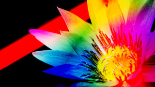
10.虹色

11.パステル系

12.中間色系

まとめ
12種類のグラデーションの違いがわかりましたか?
それぞれの良さがご理解できたと思います。
文字に合ったグラデーションを探すことも楽しいですよ。
とても簡単にできるので、デザイン初心者の方にもおすすめです。

コメント